
AEO LOYALTY PROGRAM
Designing a New Digital Loyalty Experience

Project Goal
Prior to 2017, American Eagle had the same loyalty program in place for almost a decade. The marketing team wanted to refresh and relaunch the loyalty experience from the ground up. The business goal of the relaunch of the AEO Loyalty program was to create an integrated program that was built to be digital-first with benefits that engage customers and drive brand loyalty.
My Role
I was paired with several other UX and visual designers on this project. I was heavily involved in the design of the Account section of the new Loyalty program and also created wireframes for the entire app experience. I created low and then high fidelity wireframes for each section I was responsible for. I also built prototypes and performed extensive user testing throughout the design process, assessing the usability of each phase of the design and making improvements according to my findings. At key milestones in the project, I also prepared presentations and walk throughs with the business owners.
Overall Approach
As a UX team, our approach was to redesign and improve the digital component of the experience to align with the new program benefits and provide a more seamless, intuitive and engaging loyalty membership experience across all devices. We are given business requirements and a framework for the new program that we needed to translate into a cohesive user experience. We began by breaking down the business requirements across the various phases of the customer journey and the functionality we would need to display at each stage.
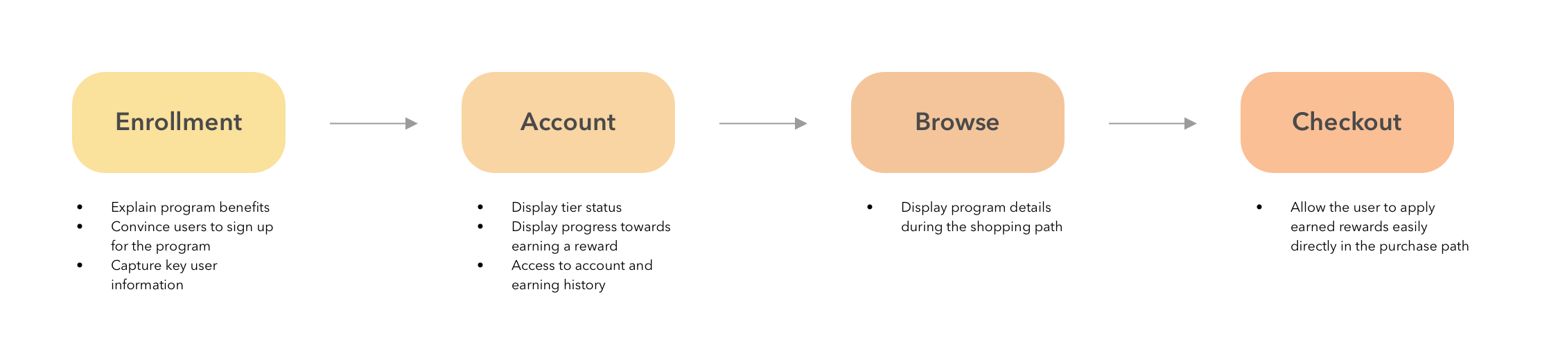
We then broke up into teams and concepted designs for each stage, coming together often to confirm that the experience was seamless across the customer touchpoints. I focused on the Account section of the flow and how we should visualize their progress in various aspects of the program (points and credits earned, dollars spent).
Concepting the Account Experience
As part of the design for the Account page, I sketched and concepted via low fidelity wireframes various ways to display the user's account status. In the program, the user would earn rewards by spending money at American Eagle and buying jeans and bras. The program also had different tiers based on their spending. The account experience needed to provide the user with a simple but engaging way to understand their tier status and their progress towards earning rewards.

Determining the Priority and Hierarchy of Information
In our first designs of the experience, we put information about the user’s loyalty status at the top of the page. Through usability testing, we found that this pushed the points and credits earned sections further down the page, sections the users would be checking most frequently .

Simplifying the Display of Points and Credits
Due to technical constraints of the platform we were working on, any points or credits were marked as pending for a period of time before they were turned into rewards. The business stakeholders wanted to expose this breakdown of pending versus available points to users in order to explain this delay in getting a reward. I was concerned that this would add an extra level of information the user didn't need and would confuse the users. I confirmed this hypothesis through several rounds of user testing. I was able to use those findings to convince the business to remove pending points and credits from the Account page and simplify the experience for the user.
Final Loyalty Account Experience
Engaging Account Landing Page
The account landing page needed to excite the user and engage them in the program. I added a hero image section at the top of the account landing page, greeting the user by name and incorporating a vibrant brand moment. In the app, this hero image collapses into the header as the user scrolls down the page.

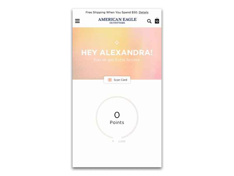
Motion with Meaning
Motion design also played a key part in the design of the account landing page. As the user scrolls down the page, we designed animations for each widget to show the user their status or reveal any pending rewards. These animations are carefully timed to only start moving as the user reveals them on the page.
Digital and Mobile First Experience
The new loyalty experience incorporates many unique mobile components including a digital loyalty card and rewards the user can add to their Apple Wallet. This digital integration helps the user always have their loyalty card or rewards with them when they go to the store. The app user also receives notifications when they earn a new reward.

Results
The AEO mobile app has been performing extremely well since the launch of the Loyalty program, with a 50% increase in app downloads and over a 100% increase in revenue and visitors compared to last year.